GRAPHIC IMPACT
ZonaZoo Acrylic Sign Brings a Blank Wall to Life at the University of Arizona.
www.graphic-impact.com
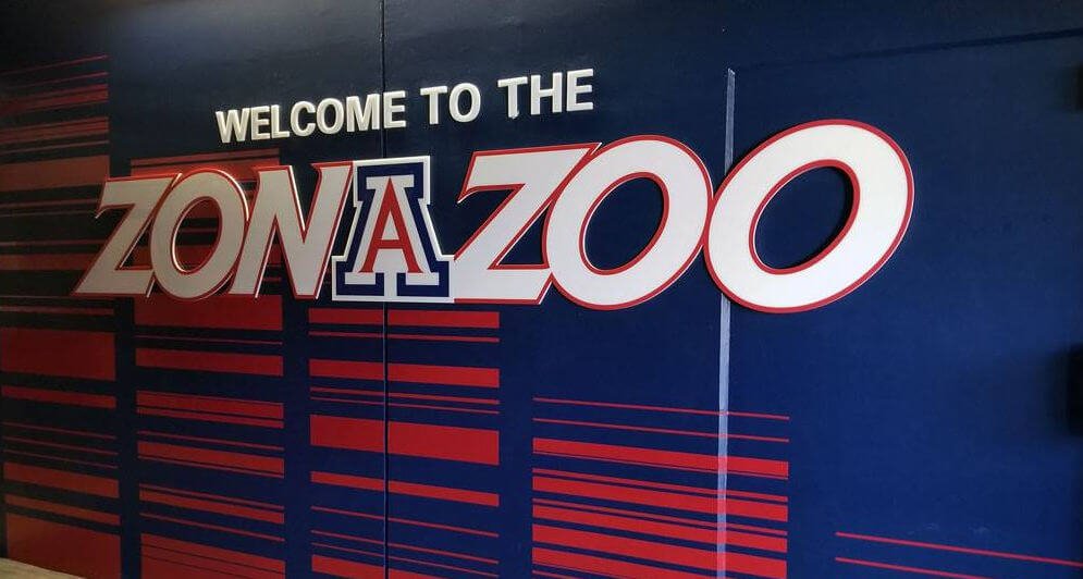
What was once a flat, uninspired masonry surface at the University of Arizona has now become a dynamic and attention-grabbing display that proudly celebrates student spirit. The challenge: bring energy and branding to the famous student section known as ZonaZoo. The result: a vibrant and dimensional sign that embodies school pride, engineered and installed entirely by Graphic Impact in Tucson, Arizona.
Transforming a Blank Canvas into a Bold Statement
The original site for the ZonaZoo branding was a plain, flat concrete wall. There was no texture, no character, and most importantly, no indication that this wall stood beside one of the most spirited student sections in college athletics. Our goal was to create something bold and dimensional that would visually energize the space and reinforce the identity of ZonaZoo.
The first step in this transformation involved painting the entire wall in the University of Arizona’s signature blue. This immediately laid the groundwork for what would become a multi-layered, multidimensional focal point for fans, students, and visitors alike.
Fabricating Dimensional Acrylic Letters
The heart of the design centered around the word “ZonaZoo” itself, which we fabricated using precision-routed white acrylic. These three-dimensional letters were not simply mounted to the wall—they were carefully crafted with red inline detailing that added a layer of contrast and school color integration. This lettering pops off the wall, both literally and visually, offering a sleek, professional appearance while commanding attention from a distance.
Custom Laser-Cut Block “A” Logo
No University of Arizona branding would be complete without the iconic “Block A” logo. To ensure accuracy and high-resolution detail, we laser-cut the Block A out of acrylic and applied vibrant, durable vinyl in official University colors. This method preserved crisp edges and ensured long-lasting colorfastness, even in the Arizona sun.
Lighting That Makes It Glow
To enhance the visual impact—especially in low-light or nighttime conditions—we incorporated LED backlighting into the rear of the sign. This feature subtly illuminates the three-dimensional letters, casting a soft glow that brings the whole display to life. Not only does the lighting add drama and professionalism, but it also ensures the sign remains visible and impactful 24/7.
Final Touches with Red Vinyl Striping
To complete the look and tie together all the design elements, we applied red vinyl stripes across the painted blue wall. These accent lines frame the signage and emphasize the motion and energy associated with ZonaZoo. This simple addition added depth, framing, and cohesion to the overall presentation.
Why In-House Capabilities Made All the Difference
What made this project possible on a tight timeline and with such attention to detail? The answer is simple: Graphic Impact’s in-house production capabilities. From laser cutting and routing to vinyl application and LED integration, every step of the process was handled under one roof. This eliminated delays, ensured quality control, and allowed us to coordinate each stage of the project with surgical precision.
Having access to a complete suite of technologies in-house—including flatbed printing, CNC routing, laser cutting, and vinyl graphics—meant that we could adapt quickly to design changes and deliver a truly customized solution without relying on third-party vendors.
A Project That Speaks to the Power of Branding
This project is more than just signage; it’s a prime example of how environmental branding can transform a space and reinforce identity. ZonaZoo is a symbol of student unity, excitement, and Wildcat pride. Now, with this eye-catching sign, its presence is felt before you even enter the stands.
The successful completion of the ZonaZoo sign showcases how Graphic Impact helps institutions elevate their branding with creativity, precision, and advanced technology. We are proud to continue our long-standing partnership with the University of Arizona and look forward to future collaborations that bring school spirit to life.
by Graphic Impact – Where Innovation Meets Impressions


