GRAPHIC IMPACT
The Ultimate Guide to Custom Vinyl Banners: Design, Uses, and Benefits.
www.graphic-impact.com
by Graphic Impact – Where Innovation Meets Impressions
When most people think of vinyl banners, they picture a temporary sign tied with bungee cords or zip ties to a fence or building. But what if we told you that with a little creativity and craftsmanship, vinyl banners can serve as durable, weather-resistant, and professional-looking permanent signage? At Graphic Impact, we specialize in transforming simple vinyl banners into long-lasting framed displays that are ideal for commercial buildings, storefronts, and construction sites.
Why Frame a Vinyl Banner?
Framing a vinyl banner instantly elevates its look and functionality. Instead of drooping corners or flapping edges, the banner is stretched tight and secured within a rigid wooden or metal frame. This not only enhances visibility and aesthetics but also improves the banner’s resistance to wind and weather. Whether you’re displaying a business name, advertising services, or showcasing promotional messaging, framing your vinyl banner gives it the permanence and polish of a traditional sign at a fraction of the cost.
Cost Savings Compared to Other Signage Materials
When compared to acrylic, aluminum, or backlit signs, a framed vinyl banner is significantly more affordable. The materials are inexpensive, and the production process is faster—especially when working with a local company like Graphic Impact that can handle everything in-house. For large-scale signage (such as 6'x8' or 4'x10'), framing a banner costs a fraction of what a rigid sign would. Even better, the vinyl can be replaced easily within the frame if your branding or messaging changes, without rebuilding the structure.
Perfect for Larger Signage Applications
Framed vinyl banners are especially useful for large-scale applications. In fact, when creating a sign over six feet wide, it’s recommended to include a horizontal support beam across the middle of the frame. This keeps the banner taut and prevents sagging over time. Larger banners allow your message to be seen from further away and can be customized with full-color graphics, large fonts, and company logos for maximum impact.
Building Signage That Meets Permit Requirements
In many municipalities, hanging an unframed banner is considered a temporary sign and is subject to time limits and strict zoning codes. However, a framed banner mounted to a building may be considered a permanent sign under local regulations. That means longer display time, fewer compliance issues, and a more professional appearance. Always check with local permitting offices to confirm specific rules, but know that framed signage often qualifies for longer-term placement.
Material and Frame Options
Vinyl banners are printed on durable 13oz or 18oz vinyl material and can be finished with hemmed edges and grommets to ensure long-lasting durability. For framing, many clients choose wood due to its affordability and ease of construction. Metal frames, such as aluminum tubing, offer a sleek, modern aesthetic and are resistant to rust—ideal for long-term outdoor use.
For an enhanced look, consider painting the wood frame to match your brand colors or using a stained finish for a more natural appeal. You can also add lighting above or around the banner to increase nighttime visibility.
Installation Tips for Framed Vinyl Banners
Installing a framed vinyl banner is relatively simple but must be done carefully to ensure longevity and stability. Here are a few key steps:
- Construct the frame: Use thick wooden planks (2x4s or 2x6s) or metal tubing, depending on your aesthetic and weather requirements.
- Stretch the banner: Lay the banner flat across the frame and pull it tight to remove any wrinkles or sagging. Attach it using staples, screws with washers, or industrial-grade adhesive.
- Mount the frame: Secure the completed sign to the building using lag bolts, brackets, or masonry anchors depending on the surface material (brick, stucco, concrete, etc.).
If you're unsure about mounting methods or want a professional installation, Graphic Impact can assist with fabrication and on-site setup.
Weather Resistance and Longevity
Framed vinyl banners are remarkably resilient when constructed correctly. The frame protects the edges from tearing or curling, and the tension reduces wind flapping that can degrade unframed banners over time. For long-term use, choose UV-resistant inks and laminate coatings to reduce fading from the sun. A well-maintained banner can last several years—even under the harsh Arizona sun.
Design Flexibility
One of the biggest advantages of using vinyl banners for building signage is the design freedom. High-resolution printing allows you to include:
- Photographs
- Detailed logos
- QR codes
- Custom fonts
- Gradients and full-color backgrounds
This is especially important for brands that want to make a strong visual impact or match their other marketing materials. At Graphic Impact, our state-of-the-art printers deliver vibrant, eye-catching graphics on banner material up to 8 feet wide—and nearly unlimited in length.
Easy to Replace or Update
Unlike traditional signage, which often requires removing hardware and drilling into walls to replace, a framed vinyl banner is easy to update. Just remove the existing vinyl and install a new banner inside the same frame. This is perfect for seasonal promotions, sales, event announcements, or when your business undergoes a branding refresh. It’s also a practical solution for tenants in leased buildings where permanent construction is restricted.
Why Choose Graphic Impact?
Graphic Impact has been producing vinyl banners and building signage in Tucson since 1989. All of our work is completed in-house—from design and printing to fabrication and installation. That means faster turnaround times, better quality control, and expert advice every step of the way. We’ll help you determine the right banner material, frame construction, and mounting technique for your specific needs and budget.
Let’s Get Started
Whether you’re a small business looking for affordable signage or a large company needing building identification that stands out, framing a vinyl banner is an excellent choice. Durable, professional, and budget-friendly—it’s signage that works as hard as you do.
Ready to upgrade your building signage? Call Graphic Impact at (520) 795-7446 or visit our showroom to get started.
The Art of Banner Making: Secrets to Producing the Best Banners for your Business.
Full color custom vinyl banners are digitally printed; although some are printed with aqueous (water-based), eco-solvent inks or UV-curable inks. Graphic Impact favors latex inks. These friendly to the environment inks produce more vivid colors and appear to last longer. There are many Chinese or Korean manufacturers of printers but we use Hewlett Packard (HP) printers for our very large banners also referred to as “grand format inkjet printers” In the production mode, these printers are capable of printing up to 1,000 square feet per hour.
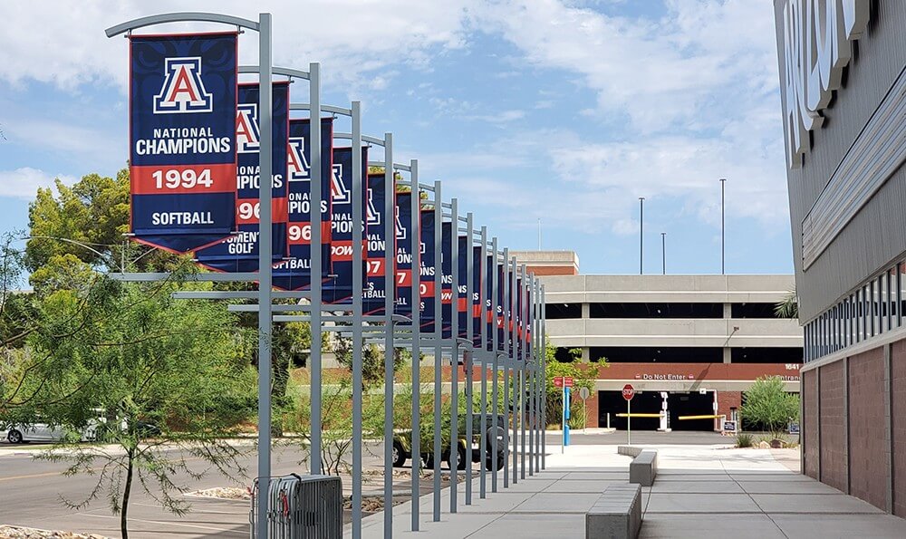
When it comes to advertising, banners are one of the most effective ways to catch the attention of potential customers. They are easy to produce, affordable, and can convey your message loud and clear. However, not all banners are created equal. To produce the best banners for your business, it’s important to follow a set of practices and techniques that ensure your message is communicated effectively. That’s where the art of banner making comes in. This article will provide you with the secrets to producing the best banners for your business. Please keep reading to learn more!
Understanding the Purpose of Banners
Identifying Key Elements to Include in Your Banner
Once you understand the purpose of your banner and who your target audience is, it’s time to identify the key elements that will make your banner stand out and effectively communicate your message. Here are some key elements to consider when designing your banner:
1. Design elements – Choose eye-catching and visually appealing design elements that will capture the attention of your target audience. This could be through the use of bold colors, striking graphics, or unique fonts.
2. Message – Keep your message clear and concise. Make sure it’s easy to read and understand from a distance. It’s important to communicate your message in a way that will resonate with your target audience.
3. Call-to-action – Your banner should have a clear call-to-action that encourages your audience to take action. This can be anything from “Shop Now” to “Register Today.”
4. Branding – Ensure that your banner includes your company’s logo and branding elements. This will help people identify and connect with your brand.
5. Location – Consider where your banner will be located and design it accordingly. A banner placed outdoors may need to be waterproof and withstand the elements, while a banner placed in a busy trade show may require a larger font to be easily visible from a distance.
By incorporating these key elements into your banner design, you can create a powerful marketing tool that will effectively showcase your business and attract your desired audience.

Choosing the Right Material for Your Banner

Mastering the Art of Color Coordination
Typography: Selecting the Best Fonts for Your Banner
