
GRAPHIC IMPACT
How to Prepare Your Favorite Photo for Large Format Printing.
www.graphic-impact.com
by Graphic Impact – Where Innovation Meets Impressions
Have you ever snapped a family portrait that looked perfect in the moment—but came out looking flat, awkward, or washed out in the final image? Or maybe you captured a breathtaking wilderness scene, only to find the colors looked dull or unnatural on screen?
You’re not alone. Even professional photographers struggle with translating real-life beauty into two-dimensional perfection. At Graphic Impact, we specialize in large format printing that brings your favorite images to life—whether it's a panoramic landscape, a cherished family photo, or a custom piece of wall art. But to get the most stunning results, the quality of the original photo matters.
Why Good Photo Balance Is Crucial for Large Format Printing
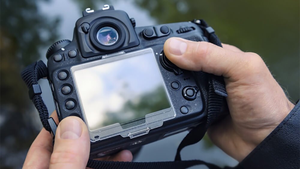
When you're printing a photo at a large scale, every detail is magnified. What might look “good enough” on your phone screen can appear pixelated, poorly lit, or awkwardly colored once it's enlarged to poster or wall-sized dimensions.
Photos that are too dark, too light, or have distracting highlights (like window glare or reflections in glasses) won’t just lose their appeal—they can actually look unprofessional. That's where white balance and lighting correction come in.
Whether you adjust lighting in the camera before snapping the shot, or use post-processing software to edit it afterward, getting your photo's color balance right can make a world of difference. Balanced photos feel natural, vibrant, and full of depth—ideal for display in homes, offices, or public spaces.
What Is White Balance, and Why Does It Matter?
White balance refers to the color temperature of your photo—the way whites, grays, and shadows appear in your image. A photo with poor white balance might look overly orange (too warm) or bluish (too cool), depending on the lighting conditions.
The goal is to make whites look neutral and natural—while keeping the other colors true to life. But don’t stress too much. There’s no such thing as a “perfect” white balance. What looks best is ultimately up to your eyes and your aesthetic. The key is to find a balance that you like and that enhances the subject of your photo.
At Graphic Impact, we can help adjust the final output to meet your standards—but sending us a well-balanced image from the start gives us the best canvas to work with.
Three Ways to Adjust White Balance Using Adobe Lightroom
If you’re not getting the balance you want straight from your camera, photo editing tools like Adobe Lightroom are your best friend. Lightroom is an affordable, beginner-friendly program used by professionals and hobbyists alike.
Here are three easy ways to use Lightroom to adjust white balance before sending your photo to us for large format printing:
Option 1: Use Preset White Balance Settings
Once your image is loaded into Lightroom, go to the Develop module. At the top of the right-hand panel, you'll see the White Balance section. Use the drop-down menu to select a preset that best matches your lighting environment (e.g., “Daylight,” “Cloudy,” “Fluorescent”). This can be a quick and effective way to normalize your image’s temperature.
Option 2: Manually Adjust Temperature and Tint Sliders
If you want more control, try adjusting the sliders labeled “Temp” and “Tint” in the White Balance panel. These sliders let you fine-tune the color temperature (warmer or cooler) and the green-magenta tint. You’ll see the changes live, so experiment until it looks right to you.
Option 3: Use the White Balance Eyedropper Tool
For the most accurate correction, select the eyedropper tool labeled “White Balance Selector.” You can also press “W” as a shortcut. Then, hover over your photo to find an area that should be a neutral gray or white—like a t-shirt, wall, or pavement. Click that spot, and Lightroom will automatically adjust the photo's overall balance to correct for the lighting in that area.
If you don’t love the result, don’t worry. Lightroom lets you reset any adjustment with the click of a button.
Extra Tips for Better Photo Quality
- Shoot in RAW: RAW files capture more color and detail data than JPGs, which gives you more editing flexibility.
- Avoid Overexposure: Blown-out highlights are hard to fix later. It's better to slightly underexpose and brighten during editing.
- Use a Tripod: Especially for landscape or indoor photography, a tripod helps you get sharper, more consistent results.
- Check Your Histogram: In-camera or in Lightroom, the histogram helps you understand light distribution and avoid clipping in highlights or shadows.
Why It Matters for Printing at Graphic Impact
When you're ready to transform your favorite image into a canvas print, wall mural, or custom sign, we want your work to shine. A properly lit and balanced photo will not only print more accurately, but it will also look more professional and visually engaging at large sizes.
At Graphic Impact, we use state-of-the-art printers and color calibration systems to ensure your image prints exactly how you imagined. But a well-prepared file always leads to the best results.
Need Help? Let’s Make Something Beautiful Together
Don't let the technical side of photography keep you from creating something amazing. Whether you're starting with a smartphone snapshot or a professional shoot, we’re here to help. From basic touch-ups to full photo editing services, our team can guide you through the process and ensure your image looks stunning at any size.
Ready to bring your photo to life? Contact us today to learn more about large format printing or to get started on your next project.