GRAPHIC IMPACT
Political Campaign Banners & Fabric Signs: Design, Readability, and Ordering (1–100+) for Maximum Impact.
www.graphic-impact.com
by Graphic Impact – Where Innovation Meets Impressions
Why Campaign Banners Still Win Elections
In the sprint of a campaign, banners and fabric signs do heavy lifting: they build name recognition, focus the message, and show momentum. With high-resolution digital printing, you can produce one banner or a hundred—each with a targeted message—without paying for expensive set-ups. Since 1989, Graphic Impact has helped candidates and committees deploy large-format visuals that are fast to read, durable, and brand-consistent.
Start With the Goal, the Location, and the Traffic
Before you open your design file, tell us where the banner will live, the estimated daily traffic, and how long it must perform. A fence on a busy arterial road demands a different approach than an indoor rally backdrop. Placement dictates size, finishing, and material. We’ll recommend the right solution—vinyl, mesh, or fabric—so your message stays readable and your hardware holds up.
Keep Letter Size Large and Instantly Readable
Readability is everything. Prioritize candidate name and one key point; everything else is secondary. A practical rule of thumb: bigger letters get read from farther away and faster in motion. For drive-by views, go bold, high-contrast typography with generous spacing. Avoid thin strokes and decorative fonts. If you must include a web address or QR code, give it breathing room and keep it simple.
Research Your Key Points—and Limit Them
By this stage, you’ve identified the platform planks most likely to move voters. Choose the top two or three and stop there. Do not cram an entire platform onto one banner. Overloaded signs are slower to process and easier to ignore. Instead, split the message across multiple banners and yard signs. Digital imaging makes micro-targeting easy: you can print small batches with different headlines without setup penalties, keeping costs controlled and impact high.
Use Consistent Branding Across Every Piece
Consistency builds trust and name recall. Lock your color palette, select one primary typeface (with a bold weight for headlines), and standardize your logo placement. Maintain the same look across banners, yard signs, street pole banners, and rally backdrops. When supporters see the same visual system at events, online, and on the street, recall skyrockets—and so does credibility.
Choose the Right Material: Vinyl, Mesh, or Fabric
- Premium Vinyl Banners: Best all-around choice for outdoor durability, crisp color, and budget efficiency. Hemmed edges and grommets handle wind and frequent handling.
- Mesh Banners: Ideal for fences and high-wind areas. The micro-perforation reduces wind load while keeping graphics legible.
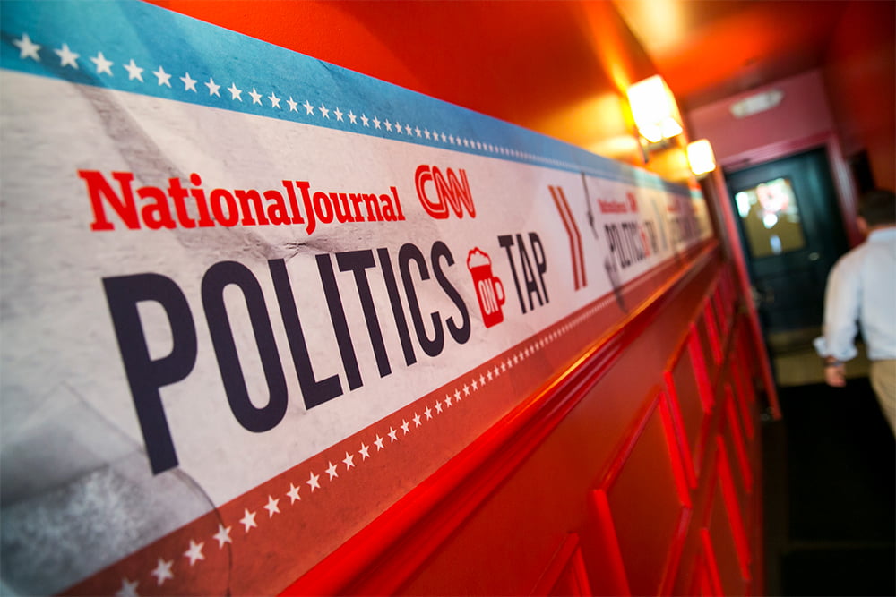
- Fabric Banners: Great for press conferences, debates, and indoor rallies. They photograph beautifully with low glare and deliver a polished, professional look.
Not sure what to pick? Tell us the environment and timeframe. We’ll match the material to the mission.
Colors and Contrast That Pop (and Pass the Glance Test)
High contrast wins, especially at speed. Dark text on a light field—or the reverse—creates fast recognition. Avoid busy backgrounds, low-contrast color combos, and long taglines. If you use candidate photography, keep it large and simple; don’t let an image compete with the name.
Smart Layout: Hierarchy, Spacing, and Fewer Elements
Think in layers. Lead with the candidate’s name, then the office sought, then a short, compelling message (or call to action like “Vote Early” with the date). Leave generous margins; don’t crowd edges. Align elements to a simple grid so the eye knows where to land. White space isn’t wasted space—it’s emphasis.
Sizing for Distance and Motion
Bigger is better for arterial roads and wide sidewalks. For fast-moving traffic, scale up both the banner and the headline so it can be absorbed in a second or two. For indoor stages and pressers, prioritize proportion and camera framing: ensure the name and office read cleanly behind a podium at typical photo and video distances.
Hardware and Finishing That Make Installation Easy
- Grommets & Hemming: Reinforced edges prevent tearing and speed up installation on fences and walls.
- Pole Pockets: Perfect for stage backdrops and street pole banners.
- Bungee Cords/Zip Ties: Help tension the banner for a flat, professional face that improves readability.
Tell us how and where you’ll mount your banner; we’ll finish it for fast, secure installs.
Order 1–100+ With Targeted Messaging
Digital printing lets you mix and match messages without setup charges. Need 10 rally backdrops with city-specific headlines? Five fence banners focused on early voting? A single oversized stage scrim for debate night? No problem. We can print one or one hundred—each customized—on the same timeline.
Compliance, Timing, and Proofing
Campaign timelines are tight. Build in time for proofing and any required disclaimers. Share deadlines, event dates, and installation details early. Our experienced team catches issues before they cost you time or votes.
What We Need to Get You a Fast Quote
- Banner size(s) and quantity (1–100+)
- Location and estimated daily traffic (indoor/outdoor, wind exposure, viewing distance)
- Desired material (vinyl, mesh, or fabric) and finishing (grommets, pole pockets)
- Artwork files or brand guidelines (fonts, colors, logos)
- Target delivery or event date
Founded in 1989—Here to Make Your Message Unmissable
Since 1989, Graphic Impact has produced thousands of political banners and signs for campaigns of every size. We’ll optimize legibility, material, and finishing so your message is clear, consistent, and effective—whether voters see it at 35 mph or in a televised town hall.
Ready to Start?
Send us your location, daily traffic estimates, and performance expectations. We’ll recommend sizes, materials, and letter heights that get read fast—and we’ll turn your order quickly, from a single banner to a full district-wide rollout.


