GRAPHIC IMPACT
Luxury Lobby Signs for Hotels &Resorts -Designed and Built by Graphic Impact
www.graphic-impact.com
by Graphic Impact – Where Innovation Meets Impressions
Make a bold first impression the moment guests step into your hotel or resort. At Graphic Impact, we create custom lobby signs that elevate your space and reflect your brand’s personality—designed to impress and built to last.
Why Custom Lobby Signs Are Essential for Hospitality Brands
Your lobby is your welcome mat, your brand showcase, and your first opportunity to wow your guests. Custom lobby signage:
Establishes strong brand presence
Enhances interior design and ambiance
Improves guest confidence and professionalism
Creates memorable, photo-worthy moments
Helps with guest orientation and wayfinding
Every element in your lobby speaks to your standards—and your signage should be no exception.
Lobby Sign Options for Every Style and Setting
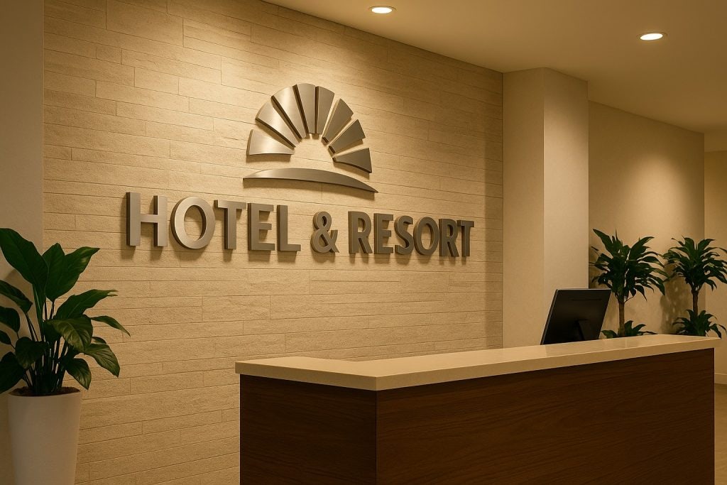
Dimensional Letters
Add depth and elegance with custom-cut letters in acrylic, brushed aluminum, PVC, or stainless steel. Perfect for modern and upscale hotel designs.
Illuminated Signs
Use LED lighting to backlight or front-light your signage for maximum visibility and a sophisticated glow that elevates evening ambiance.
Acrylic Wall Panels
Crisp and contemporary. Acrylic panels with UV-printed logos and text, often mounted with standoffs, deliver clean lines and modern charm.
Metal and Routed Signage
Classic and durable, routed metal signs and laser-etched finishes provide timeless beauty that stands up to wear and tear.
Rustic and Natural Materials
For eco-lodges, spas, and boutique hotels, wood and reclaimed materials engraved or printed with your branding offer texture and warmth.
Why Hotels and Resorts Trust Graphic Impact
In-House Manufacturing in Tucson
We design, print, cut, and build all signage at our Tucson facility. No outsourcing means faster turnaround, better quality, and lower cost.
Decades of Experience
Since 1989, we’ve been serving the hospitality industry with signage that’s both beautiful and built to last.
Advanced Production Technology
We use laser engraving, CNC routing, digital flatbed printing, and LED systems to ensure your signage meets the highest standards.
Collaborative Design Support
Our creative team will help you turn your vision into reality—ensuring your brand identity shines through every detail.
Crafted to Impress. Engineered to Last.
Hospitality signs from Graphic Impact are designed for high-traffic environments. From reinforced mounting systems to UV-resistant finishes, we make sure your signage maintains its premium look over time.
Tucson-Made Signs with National Reach
Based in Tucson, AZ, we proudly serve the local community with in-person consultations, showroom access, and expert installation. Not in Arizona? No problem. We ship nationwide and can coordinate professional installation services in your area.
Let’s Create Something Amazing Together
Your lobby signage should be as exceptional as your guest experience. Let’s design a sign that elevates your brand and leaves a lasting impression.


